Although in general, the User Interface is the same when comparing SolidWorks 2010 to SolidWorks 2011, there are some subtle differences. Lets start with one of the most simple, yet effective enhancements. I’ll bet you thought I was going to talk about the Search capability, right? Well…not just yet. While the search enhancements certainly fits into this category, there is another feature that might even be a little more simple and effective.
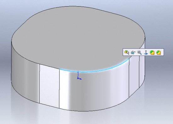
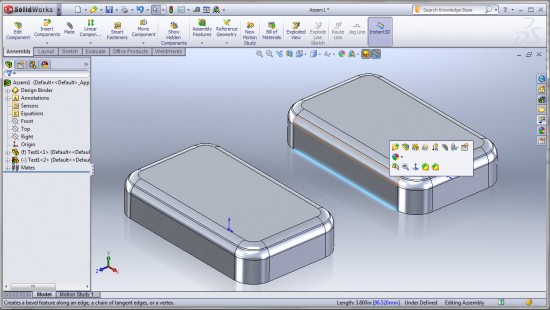
The context toolbar made its debut in SolidWorks 2008. It is a short toolbar that pops up near the mouse cursor upon left clicking a model feature or feature tree item in SolidWorks. It also appears above the menu that is display when an item is right clicked. The context toolbar has remained mostly unchanged until now. In SolidWorks 2011, the Fillet & Chamfer features have been ADDED to the context toolbar. It appears when you select an edge or face in a Part File in SolidWorks. Since Fillets and Chamfers have now been added as Assembly features, they also appear when selecting edges and faces in Assemblies!
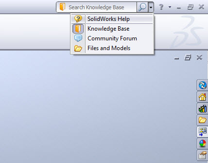
Ok…so this is a small change, but it will definitely speed up the process of adding Fillets and Chamfers to models. Perhaps the most talked about UI enhancement though has to do with Search. So many programs these days contain a search window in the upper right corner of the screen. Its simple really…Type what you want to find in the window and almost instantly you are browsing the results of the search. On more than one occasion I have “accidentally” typed a value in the “search” window in SolidWorks 2010 thinking I could search the help. (After all, this is how we do search in most web browsers…right?) In previous versions, this window only searched for models contained in your saved search paths. In SolidWorks 2011, you can set the Search window to search not just Models, but also the SolidWorks Help, Knowledge Base, and Community Forum. An example of how you set the search option is shown below.
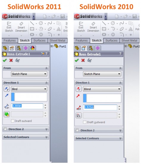
The last of the UI enhancements I’ll cover today has to do with the appearance of icons in the PropertyManager. The differences are subtle, but the icons are presented in a more consistent manner and when possible, icons that have similar meaning in other parts of the software have been “standardized” across the program. Note the use of the Draft Feature icon for the Draft option in Boss-Extrude PropertyManager as shown in the image below.
That’s all for today. Stay Tuned…more to come!
